The color on the packaging is the factor that affects the most active visual, so the color design of the packaging is very important.
Determine the total color tone
The overall sense of packaging color is gorgeous or simple, depending on the total color of the packaging color.
The total color tone is directly reflected on a basic color attribute of hue, lightness, and purity. Such as Ming tune, dark high, fresh tune, gray tune, cold tune, emphasis, weak tune, soft training, hard tune, readjustment and so on.
Area factor
In addition to hue, lightness, and purity, the size of the color area is an important factor that directly affects hue. Color matching first considers the arrangement of large-area colors, and large-area colors have long-distance visual effects in packaging displays. In addition, when the contrast between the two colors is too strong, the area of ​​one of the colors can be enlarged or reduced without changing the hue, purity, and brightness, and the adjustment can be performed.
Visibility is the clarity of the color hierarchy. Good visibility is very important in visual communication design such as packaging and advertising. On the one hand, viewing the degree of eye color itself, on the other hand, we must look at the contrast between colors. The principle and method are also introduced in detail in the advertising design. Reference can be made to its contents for the color design of packaging and decorating.
It is emphasized that the color accent color is the key color in the total color tone, and is the color used in combination with the area factor and the visibility. It is generally required that the brightness and the degree of constitution are higher than the surrounding colors, and the area should be smaller than the surrounding colors, otherwise the emphasis cannot be achieved.
Interval color separation refers to the use of another color, such as spacing or sharing, between adjacent and strongly contrasting colors, which can enhance coordination and reduce contrast. The interval color itself is mainly neutral black, white, grey, gold, and silver. If a colored interval is used, it is required that the interval color and the separated color have large differences in hue, lightness, and purity.
Gradient color gradient is a gradual change of color, hue, lightness, purity can be used for gradient changes. Gradient color has a harmonious and rich color effect, and is used more in the color processing of packaging.
The contrast color contrast color is different from the emphasis color, which is the color with the similar area and the hue contrast, this kind of color has a strong visual effect, and thus has advertising.
Symbolism This is a conceptual use that does not directly imitate the color characteristics of the contents, but also serves as a conceptual application based on the common understanding of the consumers. Mainly used for the performance of certain spiritual attributes of a product or the performance of a certain brand of ideas. Such as the packaging of Chinese cigarettes choose to symbolize the color of the Chinese nation - red.
Logo color The logo color mentioned here is not the color of the trademark, but the color used to distinguish the packaging of different kinds or similar products of different varieties. For example, different colors are used to distinguish the packaging colors of different components of the same brand of household chemicals. In processing, the area, shape and position should be changed.
Auxiliary Color This is the opposite color to the accent color, and is an auxiliary color method for adjusting the total color tone or accent color to enhance the tone level and obtain a rich color effect. In the design process, we must be careful not to distract our guests and not blindly abuse them.
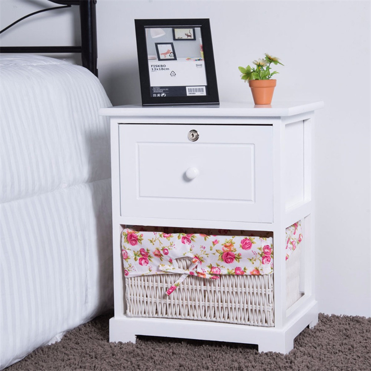
A Nightstand, alternatively night table or bedside table, is a small table or cabinet designed to stand beside a bed or elsewhere in a bedroom. It serves the role of a Coffee Table during nighttime hours, at a person's bedside. Before indoor flushing toilets became commonplace, the main function of a nightstand was to contain a chamber pot.

As a result, early nightstands were often small cabinets, sometimes fitted with a drawer, and usually containing an enclosed storage space below covered by one or more doors. Another term sometimes given to such cabinets was commode. Traditional nightstand showing space for a chamber pot Modern nightstands are usually small bedside tables, often with a drawer.
They are often used to support items that might be useful during the night, such as a lamp, alarm clock, mobile phone, desktop intercom, reading matter, a glass of water, medication, or condoms. French, Italian and Spanish antique nightstands usually have one drawer and an enclosed storage space with one door. They can be embellished with gold leaf finish, bronze or parquetry inlaid.
Wooden Bedside Table,Solid Wood Bedside Table,Bedroom Bedside Table,Bedside Table With Drawer,Modern Bedside Table,Nightstand Bedside Table,End Table,Side Table,Bedside Shelf
Jinan Tri-Tiger Technology Development Co., Ltd , https://www.jinanfurniture.com